This rather beautiful graph was recently tweeted by @EthicalSkeptic.
Some key information from it has been obscured for now to assist with making a particular point.
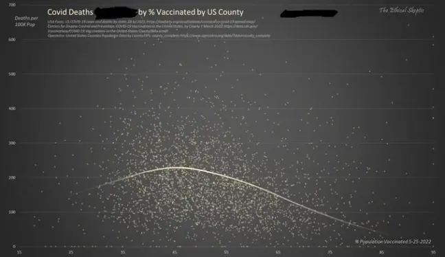
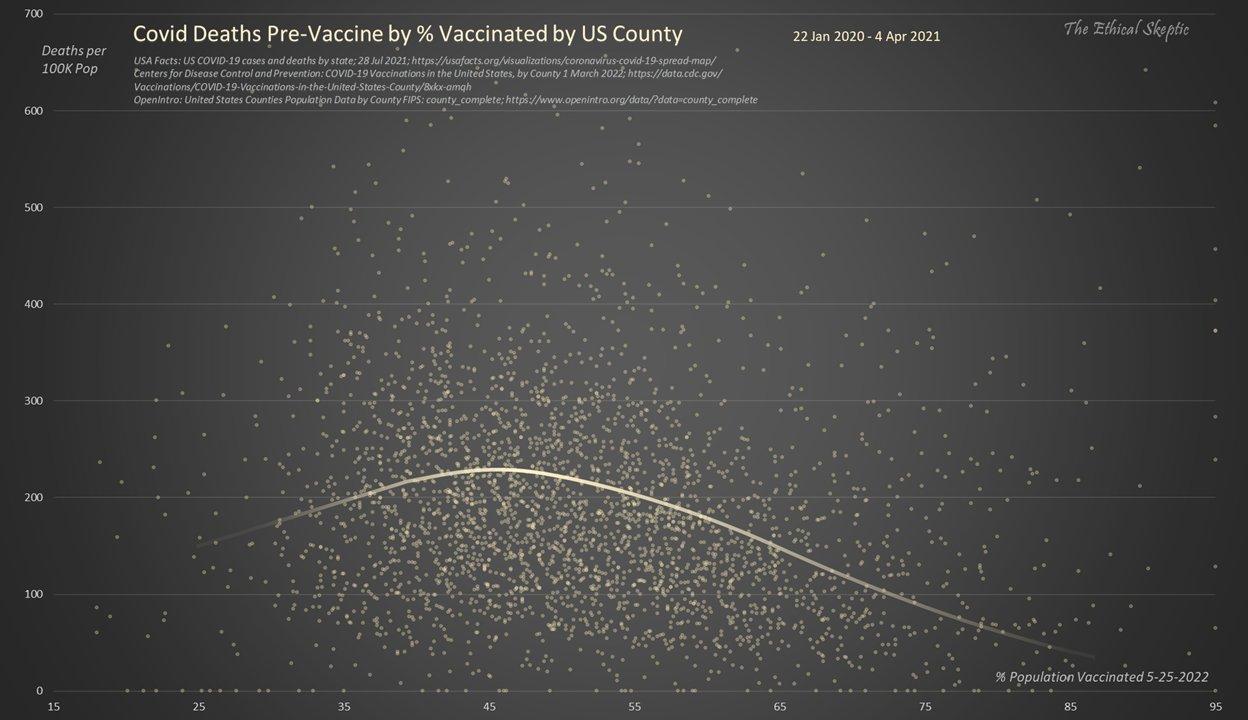
The graph shows the Covid death rate (ie total Covid-labeled deaths per 100k population during the period covered) by county across the USA on the vertical axis, and the % vaccination rate (as at 25 May 2022) on the horizontal axis.
Setting aside the fact that the data is actually extremely “noisy”, it could be argued (though shouldn’t really because of the noise) that the graph appears to support the notion that the highly vaccinated counties have lower Covid death rates.
(A discussion about the relevance and reliability of the single metric of “Covid deaths” and how it relates to lower overall all-cause mortality is certainly merited, but is outside the scope of this article).
However, here’s the big reveal: the vertical axis in the above graph is actually showing Covid death rates in the pre-vaccine period, BEFORE any Covid vaccines were available. So the most that can be (just about) said about this is that the Covid death rate before vaccines were rolled out was lower in counties which (later) had higher vaccination rates. This suggests that other important factors were at play.
This of course, is not surprising: it is likely that vaccination take-up is closely related to socio-economic factors, which are in turn also linked to health, especially rates of obesity; obesity is the 2nd most important factor (after age) determining susceptibility to a poor outcome after contracting Covid.
Here’s the graph with all the text displayed:
At this point those who are convinced that the Covid vaccines are saving lives will of course now say that notwithstanding the relationships between propensity to vaccinate and Covid mortality mentioned above, we must look at the death rates after vaccination, as these will surely show that the addition of the vaccines has anyway reduced deaths.
So let’s do that, and look at both the pre and post-vaccination eras on one graph:


This graph is now telling us 2 things: Firstly, the best-fit curve shape is identical in the pre and post-vaccine eras, but also the Covid-labeled death rates (over a near identical duration) are also basically the same. It is true that from this we cannot see for any individual county how the death rate differed between the 2 eras, but overall they all occupy broadly the same range with no discernible pattern, and the 2 best fit curves are at almost precisely the same level.
Now, it can be said that aggregating data from different parts of the USA together in this way is perhaps over-simplistic (since geography and climate affect the shape and timing of the various waves), but that does not obscure the fact that overall these graphs do suggest that the vaccines are not doing very much at all (in respect of Covid mortality) in the USA.
These types of relationships which confound the data are in fact at the heart of many of the mistaken assumptions made from simplistic eyeballing of the data – which those keen to push a particular narrative are inclined to do. The American physician, Vinay Prasad, points out here how the differences in health and other factors between the individuals receiving and not receiving the 4th injection in a key Israeli study could themselves account for the purported benefits claimed.
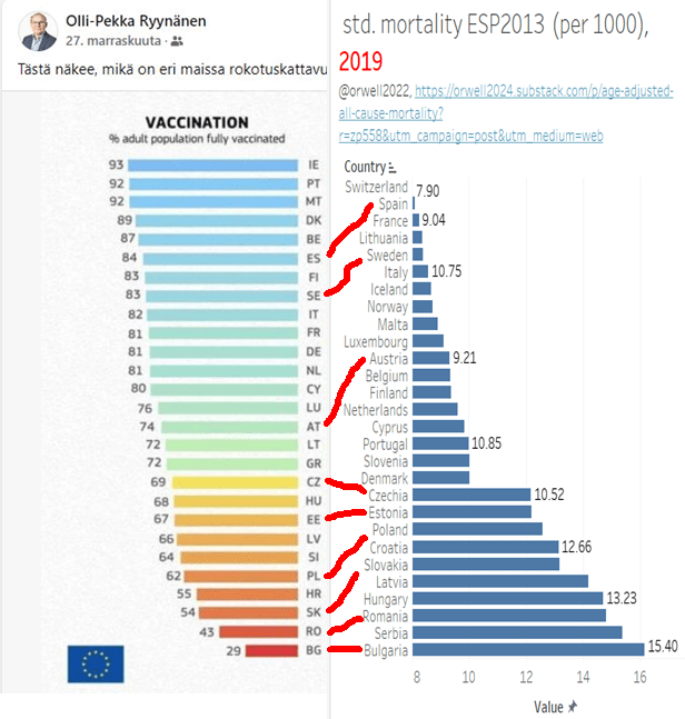
A further example of what might best be termed “spurious correlations” can be seen in the claims made about excess mortality between different EU countries being higher where there is lower vaccination uptake. Instead of this being explained by vaccination rates, as described here in this tweet and in more detail here, critical examination of the data suggests that this can easily be explained by the fact that richer countries which have higher vaccination coverage also have better overall health (in particular with much lower obesity rates) – resulting in lower age-standardised mortality rates pre-pandemic – and thus lower susceptibility to poor Covid outcomes and also to to the ill-effects from societal disruption consequent to lockdown policies.
The relationship between vaccination rates and pre-pandemic age-standardised mortality rates (a good surrogate for overall background health) is quite simply illustrated by way of this image (tweeted here):

Going back to the USA, it could easily be argued that due to the deaths of many frail / elderly in 2020, better treatment knowledge, built-up immunity and milder variants, Covid deaths in the later post-vaccine period should in fact be dramatically lower anyway even in the absence of a vaccine — leading to lower overall mortality — unless some other policy intervenes to cause harm.
However, in fact overall deaths in the USA rose dramatically in Spring 2020, and have remained extremely high throughout 2021 and into 2022 (note that data for recent months in the below graph are highly subject to processing delays).
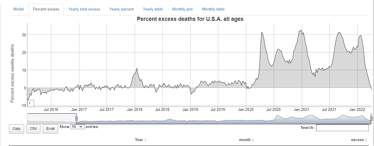


Not only have they remained high overall, but they have also remained astonishingly high in the 15 to 64 year-old age group, an age group in which the Covid burden is insufficient to account for more than a small fraction of the excess deaths:


Whatever the cause (and it will doubtless prove to be multifactorial), this represents a massive and unprecedented public health disaster.
The USA has taken a central role in attempting to drive changes (described here) to various WHO instruments designed to streamline and make more enforceable a WHO-led centralized response to future pandemics which it may declare.
It has to be asked whether — on this evidence — the USA (specifically its political administration, ‘public health’ institutions and/or any relevant regulators) should be involved in public health planning at all.
The declaration “I’m from the government and I’m here to help” has never seemed more worthy of suspicion.


