In the previous article we began an investigation of the official data regarding Covid mortality by looking at and comparing several variables by state in the USA. [1] It will be recalled that we found three significant trends:
- Cumulative Covid deaths (CCD) by state varied linearly with the 2019 crude mortality rate (CMR) of each state.
- CCD decreased slightly with increasing latitude.
- CCD represented a small portion of regular mortality rates.
These observations strongly imply that Covid deaths should be categorised as part of the baseline of normal deaths, rather than as the driving force behind excess deaths.
In this article we shall continue looking for trends in Covid mortality, first by looking at the data from Canada and then, finally, by looking at various regions around the world.
Canada
The discovery that cumulative Covid deaths decreased with increasing latitude naturally encouraged a review of Canadian data to see if the trend continued north of the US border. We begin with a bar graph comparing Covid mortality in Canada with crude mortality rates by province.
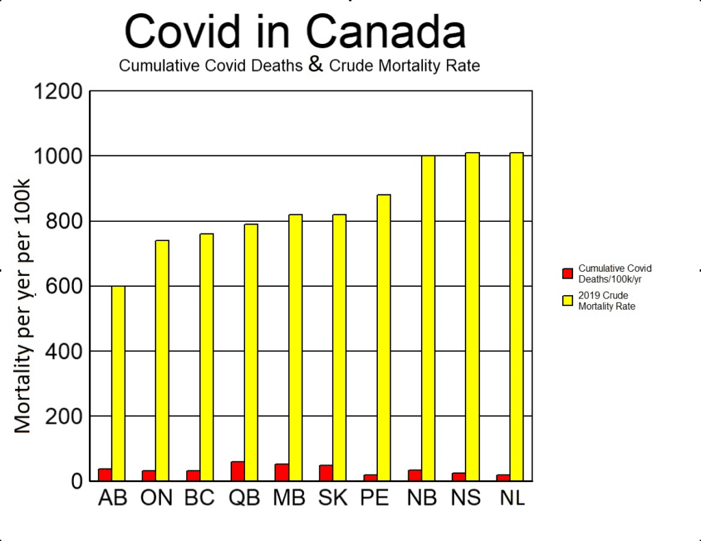
As can be seen from the above graph, CCD was, on average, about 4.5% of CMR. It will be recalled from the previous article [1], that in the USA the ratio was 11%. Some people attributed the lower Covid mortality rate in Canada as compared with the USA to stricter lockdowns. However, as we saw when comparing states in the USA, it is not necessarily appropriate to do straight comparisons of this sort without first considering other more important factors. For example, the difference might be principally due to different mortality rates. Or it could be caused by the more northern latitudes.
Did the trend in the U.S. of decreasing Covid mortality with increasing latitude carry on into Canada? To answer this question, we plot CCD against latitude for each state or province in the US and Canada. Since the vast majority of Canadians live in cities situated within 100 miles of the US border, latitudes used here do not represent the geographical centre of each province, but rather the centre of the largest one or two cities in each province. The results are shown below.
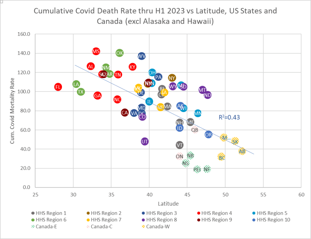
Sources: CMR:StatsCan, Table 13-10-0710-01 Mortality rates, by age group; CCD: https://health-infobase.canada.ca/src/data/covidLive/covid-19-download.csv. “CDA W” is western Canada, “CDA E” is eastern Canada, and “CDA C” is Ontario and Quebec.
In the chart above (Fig 15), it is clear that all ten Canadian provinces continue the trend of lower CCD with higher latitudes. Of particular interest is the fact that after Canada was included, the ‘best-fit’ line forced Alaska (not shown) to become an outlier. Hawaii (also not shown) is still an outlier off to the left. In both cases this was expected: we did not think that latitude factors affecting mortality rates could be consistent in the extreme north (Alaska) or in the middle of an ocean (Hawaii). Therefore excluding both outliers, regression analysis gives R-squared equal to 43%, which is moderate, and implies that the visible correlation is probably of significance.
It would be interesting to include Mexican provinces in the picture to see if the trend continued to the south as well. However, we have reason to suspect that the Mexican data is more unreliable than elsewhere.
It is not intuitively obvious why Covid deaths should vary with latitude, especially if (as claimed by many sources) these deaths were caused by a novel virus to which there was no pre-existing natural immunity. Furthermore, it is surprising that the variation should be negative (decreasing death rates with increasing latitude). To explore this trend further we plotted the crude mortality rate against latitude, to see if there were any trends in general health as one moves north. The results are shown below.
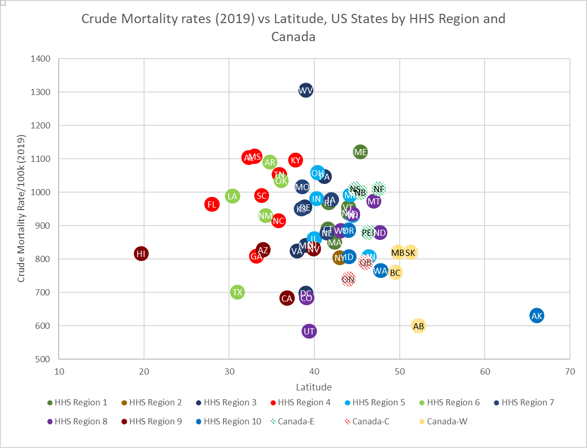
Figure 16 reveals no obvious pattern or trends in the relationship between CMR and latitude. If we combine this information with what we observed in the previous article [1], this gives us the interesting phenomenon that:
- CCD is linearly proportional to CMR
- CCD is linearly related to latitude, but CMR is not
- CMR is linearly related to median age, but CCD is not.
We have already established that the linear relationship between CCD and CMR cannot be causal: people dying in 2019 cannot determine who died in 2020 and beyond. This suggests that the pattern of Covid deaths varying with latitude is independent of general health (crude mortality) and instead has to do with other factors. It is possible that the apparent correlation might simply be by chance, for example, by Simpson’s paradox.[2] To determine if there is a true correlation, and what factors – if any – might have caused it, would require a closer look at the data. For instance, did the south typically have more Covid deaths only in the summer months, and if so, why? Does the trend persist if more localised county data is considered? Is there a correlation between latitude and average vitamin D levels that parallels Covid mortality? [3, 4] Might something apparently as obscure as the amount of tea people drink have contributed to this phenomenon? [5] Whatever the answer is, it is outside the scope of this paper.
The following three questions remain unanswered, and warrant more study:
- Are there any particular reasons why Hawaii was an outlier in terms of CCD vs CMR?
- Do those reasons account for why the northernmost corners of the continental USA were also outliers?
- Why did Covid mortality rates decrease with increasing latitude?
Worldwide trends
Were these trends with respect to Covid mortality also seen in other countries, or are they unique to North America? We begin with a look at CCD vs CMR, where we find the same distinct trend, albeit not quite as strong as in North America.

Sources: https://en.m.wikipedia.org/wiki/Member_state_of_the_European_Union; https://en.m.wikipedia.org/wiki/List_of_countries_by_popultion_(United_Nations); https://ourworldindata.org/explorers/coronavirus-data-explorer; https://en.m.wikipedia.org/wiki/List_of_sovereign_states_and_dependent_territories_by_mortality_rate
Figure 17 (above) excludes countries for which data reporting was thought to be particularly unreliable. It accounts for 5.2 billion people (66% of the world’s population), and 6.3 million reported Covid deaths (93% of all reported Covid mortality). Despite covering a period of three-and-a-half years, and representing billions of people, vastly different recording protocols, and distinctly different age profiles, the general trend is still observable.
The yearly average fatality rate of Covid globally is 0.02% (6,949,436 reported Covid deaths ÷ 7,975,105,156 people ÷ 3.5 years), which represents only a small fraction of normal deaths in a given year.
Although Figure 17 might at first appear to be somewhat cluttered, the following observations can be made:
- Other than Peru, countries are reasonably clustered by continent so that, despite the fact that some countries had substantially higher Covid mortality rates,[6] one would be hard pressed to point out which country was which, were they not labelled.
- African countries (excepting South Africa and Tunisia) cluster in what is basically a horizontal line, suggesting that Covid in Africa was independent of crude mortality rates. This was true despite a three-fold increase in CMR between countries. Total Covid deaths in this continent amounted to about 0.01% of the population, or a yearly average of 0.003%, which is a tiny fraction of normal deaths.
- Covid rates in Asia and Australia, including New Zealand but excluding China (which is not shown), also form something of a horizontal line, again suggesting independence of CMR in these countries. It also suggests independence of government responses or vaccine uptake, since these varied widely. Covid deaths totalled about 0.06% of the population in these countries, or a yearly average of 0.017%.
- North and South America, Europe, and the Middle East in general had Covid death rates that were proportional to their respective crude mortality rates.
If we exclude African and Asian countries from the graph (as these showed no correlation with CMR), and if we exclude Peru (as a wild outlier), the plot of the remaining countries is as follows:
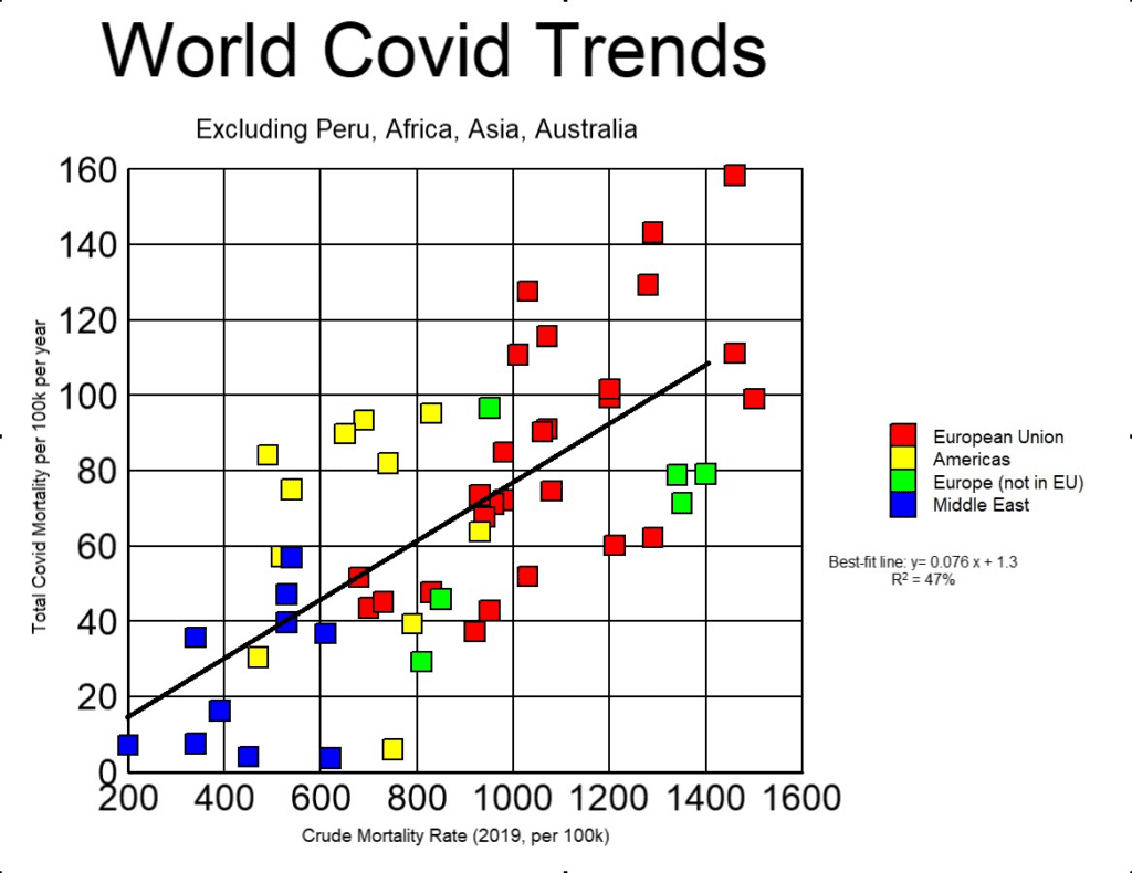
The following observations may be made from Figure 18:
- There is a near world-wide trend that total Covid mortality is linearly related to the 2019 CMR, despite a seven-fold increase in CMR. This implies that people continued to die at similar rates as they had prior to the Covid era.
- The correlation here (R2 = 47%) is not as strong as in the USA (R2 = 67%). All things being considered, the correlation is still remarkably high.
- Whereas in the USA the ratio of total Covid mortality to CMR typically increased with CMR (rising from 11% to 11.2%), for these countries this trend was slightly reversed, decreasing from 8% to 7.7%. This difference is, however, not statistically significant, given the variations from the best-fit line.
To see if there was any correlation between the size of the population of a country and CCD, a plot was made that included the same list of countries. The results are shown below.
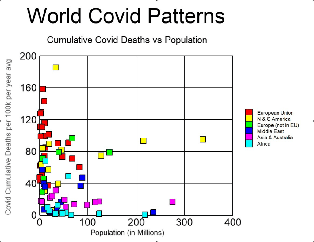
Figure 19 reveals no obvious relationship between the number of people living in a country and CCD rates. If Covid had been a novel virus with an infection fatality rate (IFR) of 1% (as claimed by some), if neither lockdowns nor vaccines worked (as the evidence suggests), and if we allow three-and-a-half years for the novel virus to become endemic, then the above graph would have shown all countries falling on a horizontal line at CCD = 286. That this is the case may be proven as follows:
First, the equation for calculating CCD that we have used is:

If the entire population was exposed to Covid by the end of June 2023, then:

Inserting equation (2) into (1) gives:
Plugging a value of 1% for IFR into equation (3) gives CCD = 286, independent of population. In Figure 19 the countries in North and South America lie on an almost horizontal line at about CCD = 80, which would correspond to an IFR of 0.28%. Asia, including Australia and New Zealand, also approximates a horizontal line at about CCD = 18, (IFR = 0.06%). European countries, on the other hand, are scattered and show no trends. It is unlikely that the same disease could vary so drastically in its IFR simply by crossing borders or by travelling from one continent to the next (especially since it is claimed that the variants were common across the world). It is more likely that the term ‘Covid mortality’ was tracking something else other than a novel virus, such as deaths from bacterial pneumonia.[7, 8] Either way, it would appear that all the fuss, efforts, restrictions, and doses of Covid shots in America and Europe were a colossal failure: they only served to increase Covid deaths.
World Latitude Considerations
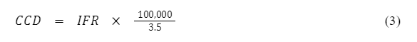
Lastly, we plot cumulative Covid deaths against the latitude of each country that we have thus far included in our analysis. The results are shown below.
As can be seen from Figure 20, Asia (including Australia and New Zealand) and Africa reveal no correlation between Covid deaths and latitude. This was expected, since we already saw that Covid mortality in both regions was uniformly tiny.
Countries in the Middle East show a weak trend (R2 = 19%) opposite to that found in North America, so that here Covid mortality generally increased with increasing latitude. The rate of increase was about 1.7 extra Covid deaths per 100,000 people per year per degree latitude northward. In our discussion of this phenomenon in the USA and Canada, we asked whether vitamin D or tea might have contributed to the trend. It is conceivable that Middle Eastern countries have cultural practices and diets that tend to reverse the influence of these two factors relative to what happens in North America. However, investigating this further is beyond the scope of this article.
It is also observed from the above graph that when South American countries are compared to Canada and the USA, any trends in Covid mortality by latitude disappear. The yellow dots in Figure 20 appear randomly scattered.
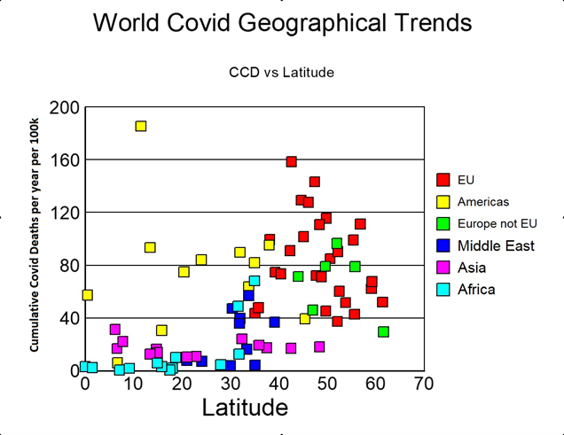
The countries in Europe, however, do show some vague semblance of a trend. To identify this, we plot just European countries. The graph is shown below.
As can be seen from Figure 21, there is a very weak trend (R2 = 4.9%) of decreasing Covid mortality with increasing latitude. While in Canada and the USA the trend was about two fewer Covid deaths for every degree of latitude northwards, in Europe the trend was only half as much. The increased scatter in Europe may reflect the fact that there are many countries with noticeably different cultures and diets, whereas in North America there are only two countries with somewhat similar cultures. However, the matter needs to be studied further before anything particular is affirmed.
Conclusions
We have examined Covid mortality during the Covid era and found several interesting patterns, which are summarised as follows:
- Except for Asia and Africa, there was a strong correlation between cumulative Covid deaths in any region and the 2019 crude mortality rate.
- This correlation was so strong that it dwarfed any outcomes from human interventions taken by governments during the period.
- In those countries where Covid was proportional to crude mortality, Covid mortality amounted to between 8% and 11% of the previous crude mortality rate.
- Covid mortality is a small fraction of regular mortality.
- This proportional correlation strongly implies that deaths attributed to Covid belong in the expected baseline of all-cause mortality data.
- In those countries where Covid was not proportional to crude mortality, Covid mortality was very minor. In Africa it amounted to about 0.003% of the population per year. In Asia it was slightly higher, at 0.017%.
- The world-wide average fatality rate of Covid was 0.02% of the population per year. This is a small fraction of normal yearly deaths.
- There was a weak correlation between Covid mortality and latitude. The relationship was negative in both North America (two fewer Covid deaths per 100,000 people per year per degree north) and Europe (one less Covid death per degree north), and positive in the Middle East (1.7 more Covid deaths per degree north). The trend was not discernible in Africa, Asia, or South America. It is not clear what caused this trend, nor how statistically significant it is.
- Covid mortality had different trends on different continents. A population-based analysis that assumed it took 3.5 years for Covid to become endemic suggested that Covid may have had an average fatality rate of 0.06% in Asia, whereas in North and South America it might have been as high as 0.28%.
- If there were any positive outcomes from all the various government attempts to control and restrain Covid (i.e. lockdowns or Covid shots), the outcomes could not be discerned from the data.
- The extra Covid mortality in places such as North and South America, and in Europe, relative to the rest of the world suggests that ‘Covid mortality’ statistics were not tracking deaths from a novel virus, but something more common, such as bacterial pneumonia.
- It is possible that all the efforts to contain Covid actually had a negative effect, and instead increased mortality.
- It is possible that the extra deaths attributed to Covid in America and Europe simply reflect different protocols for documenting a Covid death.
In summary, if we take official Covid mortality data at face value, all the patterns and evidence argue that if governments and the media had never mentioned Covid, nobody would have noticed anything out of the ordinary.
References
- Verduyn, Thomas, “Covid mortality patterns in the USA,” PANDA, 2023, https://pandata.org/covid-mortality-patterns-in-the-usa/
- Anonymous, “Simpson’s Paradox,” Wikipedia, 2023, https://en.wikipedia.org/wiki/Simpson’s_paradox
- Villasis-Keever, Miguel, et al, “Efficacy and Safety of Vitamin D Supplementation to prevent Covid-19 in Frontline Healthcare Workers. A Randomized Clinical Trial,” Archives of Medical Research, Vol 53, Issue 4, 2022, pgs 423-430, https://doi.org/10.1016/j.arcmed.2022.04.003
- Borsche, Lorenz, et al, “Covid-19 mortality risk correlates inversely with Vitamin D3 status, and a mortality rate close to zero could theoretically be achieved at 50 ng/mL 25(OH)D3: Results of a systematic review and meta-analysis,” PubMed, 2021, doi: 10.3390/nu13103596. PMID: 34684596; PMCID: PMC8541492.
- Liu, J, et al, “Epigallocatechin gallate from green tea effectively blocks infection of SARS-CoV-2 and new variants by inhibiting spike binding to ACE2 receptor,” Cell Biosci 11, 168 (2021), https://doi.org/10.1186/s13579-021-00680-8
- Anonymous, “COVID-19 pandemic death rates by country,” Wikipedia, 2023, https://en.wikipedia.org/wiki/COVID-19_pandemic_death_rates_by_country
- Engler, Jonathan, et al, “Whodunnit? {Unabridged},” Where are the Numbers Substack, 2023, https://wherearethenumbers.substack.com/p/whodunnit-unabridged
- Rancourt, Denis, “Nature of the COVID-era public health disaster in the USA, from all-cause mortality and socio-geo-economic and climatic data,” 2021, https://denisrancourt.ca/entries.php