There are multiple events that happened in January 2020 that are, to put it mildly, peculiar. One of them is that only 23 days after China reported that they had found a few cases of an “unknown pneumonia” in the city of Wuhan, three people in Baltimore Maryland launched a dashboard that was designed to track the number of cases and deaths of this disease in every country in the world. All three were connected with the Department of Civil and Systems Engineering at John Hopkins University (JHU). In their own words, the dashboard “was developed to provide researchers, public health authorities, and the general public with a user-friendly tool to track the outbreak as it unfolds” [1]. Along with the dashboard they also maintained a public data repository of cases and deaths [2].
The January 22 launch happened so early on in the Covid timeline that the first WHO situation report had only been released the preceding day, and the term “Covid” had not even been coined yet. In that first WHO report it was announced that “282 confirmed cases of 2019-nCoV have been reported from four countries including China” [3]. Total cases outside of China were only four, and there had been zero deaths. In fact, only six deaths were officially linked to the virus by this date, and all of them were from Wuhan. For comparison purposes and to put things into perspective, the norovirus is estimated to infect 685 million people and cause 212,000 deaths every year [4]. We are not aware of a norovirus dashboard anywhere in the world.
Odd as it might be that a team at JHU chose to create and launch a dashboard for an unnamed disease despite such low numbers of cases and deaths in so few countries, there are possible explanations for why they did so. Only 3 months earlier JHU had hosted Event 201, a “training tabletop exercise… based on a fictional scenario” of a novel coronavirus causing a global and deadly pandemic [5]. Furthermore, the lead author of the dashboard (Professor Lauren Gardner) is a specialist in modelling infectious diseases. Notwithstanding what these facts might suggest, the dashboard was, at least according to their own testimony, the result of a “spur-of-the-moment” decision and took “just a few hours” to build [6].
Despite this hasty beginning, the new website [7] certainly garnered a lot of attention in short order, rapidly becoming the premier data site for media outlets, medical researchers, health authorities, and the general public, not only in the US but also around the world [8, 9]. Within two months of its launch, the website was reportedly being “accessed 1.2 billion times per day,” [10] or nearly half the traffic of the internet giant Google. Within two years it had been cited by medical researchers in more than 8,500 articles [11].
“The Hopkins dashboard has become a ubiquitous and trusted reference point, cited by U.S. federal agencies and major news sources” [12].
Given how much influence the JHU dashboard exerted on the world during the Covid event, it is appropriate to examine it in some detail. In particular, we here discuss some of the difficulties of obtaining data in real-time, the sources they used to obtain that data, how they put data into their system, the language barriers involved in the process, and, finally, the role that computer simulations may or may not have played. The article is rounded out with an example from one particular city, namely New York.
Obtaining Data in Real-time
Even with the help of modern computers, it typically takes many months (or even years) to produce reliable mortality data. For example, the latest year for which official all-cause mortality figures are available in Canada is still only 2020. The national statistics office, StatsCan, is quick to point out that “reporting delays” and “incomplete data” are the reason behind the three year effort [13]. If it currently takes two or three years for a federally funded organisation such as StatsCan to publish mortality data, how was it possible for JHU to get Covid death data in real time?
It is equally challenging to produce statistics about one particular pathogen or virus. For instance, seven months after the 2017/2018 flu season had ended, the CDC in the US was still only providing estimates for cases and deaths. Their stated reason was that “data on testing practices and deaths from the 2017-2018 season” were not yet available [14]. The date of that statement was 22 November 2019. Exactly two months later the JHU dashboard went live, promising information on cases and deaths in real-time of a newly found respiratory virus that is similar to the flu. If it takes months or years to obtain mortality and case data for the flu, how was it possible to obtain data for Covid in real time? If it was not possible to do this in 2019, how did it suddenly become possible to do it in 2020?
Naturally, there are plenty of countries in the world where data reporting is unreliable at the best of times. Likewise, the Human Mortality Database, which tracks mortality by country, is regularly ten years behind for many countries [15]. How then did JHU expect to be able to plot Covid deaths for every country in the world in real time? More crucially, how did they possibly update their dashboard “every 15 minutes”? [1, 16]
Data Sources for the JHU Dashboard
Good data depends on good sources, and the only way to understand how the JHU dashboard obtained their data in real time is to examine their sources. Of significance is that their sources changed over time. Initially, their primary data source was “DXY, an online platform run by members of the Chinese medical community, which aggregates local media and government reports to provide cumulative totals of COVID-19 cases in near real time at the province level in China and at the country level otherwise” [1]. This source, therefore, was a combination of news and government reports.
Eventually the team at JHU felt that DXY was taking too long to obtain and publish data, so they branched out to include other sources: “To identify new cases, we monitor various Twitter feeds, online news services, and direct communication sent through the dashboard.” As health agencies around the world set up their own dashboards, JHU incorporated them into their list of sources [2].
JHU therefore acknowledged three primary sources of information other than official government websites:
- Twitter feeds
- online news services
- direct communication sent to the dashboard
To the best of our knowledge, no details are provided about any of these three categories of sources. All three have the potential to contain incorrect, exaggerated, or entirely fabricated information. None are either publicly accountable or subject to independent verification. No specifics are provided about who could or did communicate directly to JHU.
Scraping the internet for news stories about Covid certainly has the potential to speed up the process of collecting data. Unfortunately, and beside the above named problems, it also introduces the possibility of a noise-amplifying feedback loop. After all, if “major news sources” were trusting JHU for accurate data, how could JHU be getting their data from (potentially) the same news sources?
Duplicates
Furthermore, even assuming that all the sources used by JHU were accurate, the task of “combining multiple data sources is a complex process” [17]. One notable challenge is how to handle duplicates. Whenever information is obtained from more than one source it becomes possible that the same event is counted twice. News outlets, after all, do not include health identifiers of the people mentioned in their stories. How then did JHU de-duplicate the data? Does this mean that Covid case and death counts as reported by the dashboard may have been two, three or many times higher than reality in some regions? Indeed, there are occasions when users of the data were convinced the dashboard did contain duplications [18]. For example, on 11 March 2020, one user of JHU’s data repository wrote: “There is a challenge with inserting duplicate data into a stream that never contained it before. Reporting both at the state level and the city level in the same column is bound to cause problems” [18a]. To which another user replied, “CSSE appears to double count cases and deaths” [18b]. CSSE (“Center for Systems Science and Engineering”) is the acronym for the department at JHU that managed the data repository.
Worldometer as a Data source
JHU expressly mentions Worldometer as one of their sources [2]. Worldometer themselves confirm this fact, saying: “Our data is also trusted and used by… Johns Hopkins CSSE” [19]. In general, Worldometer uses computer simulations to report statistical information in “real-time.” Their simulations are based on yearly totals and computer estimates. For instance, if one million people die in motor vehicle accidents every year, then on average one person perishes every 31.6 seconds. The Worldometer dashboard for accidents would simply add one new death accordingly whether or not anyone actually died during that amount of time. Naturally, Worldometer would have no way of knowing if anyone did die.
Did Worldometer use computer calculations to determine Covid statistics in a manner similar to what they do for motor vehicle accidents? If they did (and because they could not know the yearly totals in advance), did they use epidemiological models rather than real deaths to estimate how many people were going to die that year from Covid? Neither question can be answered with certainty. Their list of sources only includes government institutions [19]. However, since a full list of sources is not available, and since they do not expressly deny using computer algorithms, it is quite likely that Worldometer did use computer models to generate their Covid statistics. This is made more certain by the fact that governments would not have been able to generate Covid information in real-time.
In May of 2020, CNN published an interesting news article that highlighted the confusing nature of the relationship between the JHU dashboard and Worldometer [20]. The responses from JHU to questions that were asked of them in preparation for that article were somewhat evasive, and left more questions than answers [21].
The fundamental question that remains unanswered, of course, is why would JHU use Worldometer as a source in the first place? Since JHU used Worldometer as a source, does that mean that the underlying data on the JHU dashboard was also based on computer models rather than real events? Part of the reason why it is so difficult to answer any of these questions is that the code used by the dashboard was not open source, a complaint frequently levelled against the platform by users [22]. Another reason is that data was often input into their system without either explanation or verifiable references.
Inputting Data into the System
According to the Lancet article by Gardner et al, for the first ten days after the launch of the JHU dashboard, “all data collection and processing were done manually, and updates were typically done twice a day” [1]. From a logistical perspective this was doable since there were so few cases and only a few countries involved during this period of time.
Concerning accuracy of the data, they claimed that “[b]efore manually updating the dashboard, we confirm the case numbers with regional and local health departments…as well as city-level and state-level health authorities.” It has already been established, however, that neither Canada nor the US could produce either mortality or influenza data within a six month time frame. How then did not only Canada and the US, but eventually every country in the world, provide daily case and death counts that JHU could use for verification?
In an attempt to answer this last question, the websites of Statistics Canada were examined to see how they obtained their Covid data. It was found that StatsCan did the same as the JHU team did, for they also used “web scraping techniques to gather relevant data from a variety of websites on COVID-19” [23]. Since no information is provided about which websites were scraped, I emailed StatsCan to obtain a list. Their kind reply stated: “Statistics Canada will not have a comprehensive final list of all potential websites used for web-scraping during the pandemic.” Two reasons were given: first, several divisions were involved, each with different procedures, and second, confidentiality issues. StatsCan suggested we contact the Public Health Agency of Canada (PHAC). However, PHAC was relying on StatsCan for the information, and StatsCan was doing the web scraping, not PHAC [23]. Does this reply mean that StatsCan does not know where they got their Covid data from? Or does it mean they know and are unwilling to share their sources with the public?
The reply from StatsCan leaves one wondering if their information came from the JHU dashboard. Given how popular the JHU dashboard became, that it was expressly designed to enable health authorities to track the outbreak, that it was cited by US federal agencies, that it has been widely used by medical researchers, and that StatsCan scraped the web to obtain their data, it is quite likely that StatsCan did. Even if Canada did not, it is more than likely that some countries did adopt the JHU data as their own. How could JHU confirm their data with health authorities if those same health authorities were getting their data from JHU?
In view of this, there exists the very real possibility that JHU uploaded data to their dashboard, some countries used and published this information on their own websites, and then JHU confirmed their entries by comparing their numbers with those on official government websites. If this happened, it is circular reasoning at its finest. Unfortunately, there is no way to prove if this did or did not happen. Either way, it still leaves us wondering what sources JHU used for their data.
Automatic Updates
Whatever the sources were, manual updates were soon terminated in favour of automation:
“The manual reporting process became unsustainable; therefore, on Feb 1st 2020, we adopted a semi-automated living data stream strategy.” [1]
The word “unsustainable” makes it sound like they were being swamped with Covid cases. The actual facts refute this. According to the WHO reports there were only 19 countries reporting cases on this day [24]. This might have involved 80 to 100 entries on the first of February. It is not at all clear how so few entries were considered unsustainable.
The Lancet article asserts that the manual updates were first confirmed with the appropriate health authority. Nothing whatsoever, on the other hand, is said about whether or not automated inputs were ever confirmed.
Furthermore, is it even possible to automate data collection across multiple websites from a growing list of countries, when every website uses different formats to display their data? This question is especially valid given how often these formats were changed during the Covid event. Indeed, as one study group found, as late as May 2021 there were still no “standards” for reporting Covid data [17]. How then did the small JHU team do it when they themselves eventually acknowledged all these problems? [16]
Language Barriers
Two of the three people involved in designing the JHU dashboard were native to China, the third was American. This would have enabled them to read the Chinese reports published on the DXY website. But not every country in the world publishes data in either Chinese or English. The difficulties of extracting data from websites in foreign languages are significant even with automated translation tools. Automating this globally is almost inconceivable. Scraping the internet is nigh impossible when the websites being searched are in a language unknown to the researcher. Challenges of this sort are commonly experienced by anyone doing global research, and as a result researchers often confine themselves to countries that use a language known to them. How then did the JHU team do it?
First out of the Gate
The JHU dashboard was almost always the first website to report the first Covid case in a given location. Gardner claimed that:
“the dashboard is particularly effective at capturing the timing of the first reported case of COVID-19 in new countries or regions…With the exception of Australia, Hong Kong, and Italy, the CSSE at Johns Hopkins University has reported newly infected countries ahead of WHO, with Hong Kong and Italy reported within hours of the corresponding WHO situation report” [1].
Contrary to what this statement implies, dashboards do not capture this type of information, people do. How is it possible that the small JHU team responded so fast as to find the first new case in almost every single country before anyone else did? Is it only a coincidence that Gardner had recently developed a model that used air-travel patterns to predict exactly this? Writing about that model, she said: “the model provides the expected number of (the 100) imported cases arriving at each airport globally” [25].
Was this model so accurate that it aided JHU in finding each first new case? Given how inaccurate the model was, that scenario is highly unlikely: the same model had predicted case numbers in China that were five times higher than what was being reported. Despite this glaring problem with her model, Gardner still felt that it was more accurate than fact-based reports:
“We believe the actual number of 2019-nCoV cases in mainland China are likely much higher than that reported to date. Specifically, we estimate there to be around 58,000 cumulative cases of 2019-nCoV in mainland China by the end of January (as of January 31, the reported cases is close to 12,000).”
Is it not possible, therefore, that Gardner also felt that her predictions of when and where the first cases should occur were also more accurate than what any country was reporting? Did JHU report new cases on their dashboard based on their models? Is this why she said “the dashboard was particularly effective at capturing…”? If so, did other countries, and the WHO, believe what JHU had reported, and subsequently report it themselves?
Computer Modeling as the main source of data
The only answer that provides a rational explanation for all the questions asked thus far is that the JHU dashboard was based on computer simulations rather than observational data. It also appears that from time to time the JHU team obtained empirical data that was then used to adjust and “correct” the output from their models [26, 27]. The reasons why this is the most plausible answer is as follows:
- Governments are not capable of providing data in real time
- It is too difficult to extract data from news media sites in foreign languages
- Dashboard entries were automated
- There was no valid way to de-duplicate the data if obtained from news sources
- The dashboard was updated on short intervals (15 minutes or hourly)
- Sources include Worldometer, a site specialising in computer simulations
- Sources also include “direct communication to the dashboard,” which could have involved data from a computer simulation
- It is not known whether automated entries were confirmed in any way
- The dashboard was designed to provide health authorities with data
- Health authorities trusted the JHU data as accurate
- The repository contains multiple data dumps to “correct” the data
- The dashboard reported the first new cases in a country before anyone else did
Evidence for the use of Computer Modelling
On 4 March 2024 I sent an email to Lauren Gardner (the lead author of the JHU dashboard project) asking whether or not computer models were used at any point for the dashboard, and whether the models were available. Unfortunately, no reply has been received to date.
Lacking verbal confirmation, and having thus far only found circumstantial evidence, it was necessary to keep digging for perhaps better evidence as to whether or not JHU used computer models to obtain their data. Not surprisingly, the evidence exists. For example, on 13 March 2020 Professor Lauren Gardner spoke at a congressional hearing on Capitol Hill to explain the dashboard. During the presentation she expressly mentioned “modelling efforts that we are doing behind the scenes” [10].
Furthermore, on the JHU website it says:
“Gardner is a specialist in modelling infectious disease risk, including COVID-19….Gardner leads COVID-19 modelling efforts in partnership with U.S. cities to develop customized models to estimate COVID-19 risk at the local level.” [28]
When these two quotes are combined with the fact that Gardner was reported to be so busy managing the dashboard in early 2020 that she had no time to do anything else, it is certain that the modelling work was for the dashboard. Indeed, and as one article pointed out, “working around the clock for 10 weeks straight, they’ve been so consumed with dashboard maintenance that they’ve had little time to analyze the data it actually shows” [6].
It is also worth noting that in 2019 Gardner developed “a novel mathematical modeling framework” for estimating a viral outbreak, a model which was meant to be “calibrated using historical outbreak data” [29].
Moreover, the website for JHU’s Center for Systems Science and Engineering states that modelling is one of the foundational pillars of their department. The CSSE department defines itself with these words: “Systems science is a modelling approach that embraces the dynamic interaction of engineered, human-behavioural, and natural components in time and space” [30].
Therefore, based on the fact that Gardner is an expert in disease modelling, is accustomed to calibrating models with empirical data, was actively involved in developing models for Covid, has gone on record that her models are more accurate than officially reported numbers, and that her department considers modelling fundamental to approaching any problem, it should be taken for granted that computer models were being used as the underlying source of data. In other words, unless strong evidence exists to the contrary, it is certain that the JHU team was using computer models to generate case and death numbers. No direct evidence has been found however.
In agreement with these sentiments, a survey by Jesse Pietz et al of 25 different Covid dashboards expressly states that the JHU dashboard was using the SIRD (Susceptible, Infected, Recovered, Deceased) epidemiological model in 2020 for simulating the spread of Covid [31].
Finally, an interesting Twitter thread was posted in November 2020 that provides evidence that Ensheng Dong (the undergraduate that built the dashboard) was uploading data to the JHU repository with data created by computer modelling [32]. (Although we regret that the significance of this thread escaped our attention for so long, we do acknowledge that discovery of it formed a significant part of the impetus for the research that led to this article.)
In August 2022, Ensheng Dong et al published a review of their dashboard that discussed some of the lessons learned and challenges faced along the way. The authors assert: “In line with our commitment to open data, the data displayed on the dashboard have solely come from publicly accessible sources” [16]. And a little further on they added, “the dashboard relied entirely on publicly available data.” Does this mean that the dashboard only used fact-based empirical data? Not necessarily. Worldometer is a “publicly accessible source” that was almost certainly based on computer models. Furthermore, some governments used computer models to estimate how many people were going to get sick or die from Covid. The output from these models were also publicly available. And, it is not unreasonable to think that some health authorities were getting their numbers directly from JHU models in the first place. Noteworthy is the fact that they do not say they only used empirical or observational data.
Computer models were used in multiple countries to estimate Covid cases and deaths [33, 34]. However flawed the models were (and they were terribly flawed [35]), it was always understood that they were only models [36]. The JHU dashboard, on the other hand, claimed to be delivering real-time data of actual Covid cases and deaths. The evidence strongly suggests otherwise.
Confounding the Data
There are multiple problems that will naturally follow if a respected dashboard purports to be hosting empirical data suitable for use by health authorities, but the underlying data is actually being generated by computer models. These problems are guaranteed to persist even if the data is “confirmed” and updated with data from official government websites.
A few of the notable problems that will arise are:
- Some countries, knowing that they are unable to obtain data in real time, will be inclined to trust the dashboard and use its numbers for their own. JHU then “confirms” its own estimates against the “official” numbers. Since the official numbers were based on their own estimates in the first place, the error is confirmed, and neither the JHU data nor the country’s official data are correct. The result will be that Covid numbers in some countries will be as wrong as the computer models.
- Other countries will rely on their own data entirely. When JHU “confirms” their estimates, the JHU data will be corrected. In this scenario the data will be as correct as testing and lab diagnostics allow, or as the data from those countries permits.
- As a result of the above, two neighbouring countries may have vastly different rates of Covid cases and deaths, not because Covid behaved differently in the two countries, but because one country accepted the JHU data as reliable and the other did not. The end result will be that it will be impossible to compare Covid statistics between countries.
- Since JHU data was broken down by cities in some regions of the world, some cities may have accepted the JHU data while others did not. The result will be that Covid statistics may be empirically-based in one city and model-based in another. This will render it impossible to compare one city with its neighbour.
- In those countries where JHU provided city level data, since some cities used the JHU data as their own while others did not, the aggregate values for each province or state may be meaningless.
- The net effect of some regions accepting the JHU data and others not, both at the city, state, and country levels will mean that any computer algorithms used in the JHU models will be visible for some geographical locations but not for others. As a result, in some places the data will fit a SIRD model while in other places it will not. This will render epidemiological studies hopelessly confused.
All of the above-mentioned problems have been central aspects of the many discussions surrounding Covid — not only that we ourselves have engaged in and written about, but also that we have read about or are aware of. For instance, we found from studying Italy that Covid deaths aligned with regional borders rather than with what one would expect from an epidemic of a novel virus [37]. When studying New York City we found that what reportedly happened in that city did not happen in other large cities in the US [38]. When studying mortality patterns around the world, we found that Covid “respected” regional borders in unexpected ways [39, 40]. Therefore the actual problems that surfaced while studying the Covid data aligns with the type of problems one would expect if the JHU dashboard was based on computer simulations augmented by observational data.
An example of how serious it can become when information is believed to be based on real facts though it is based on a computer model is the disappearance of flight MH370 in 2014. The software used by Malaysia Airlines for tracking aircraft led them to believe that the missing plane was over Cambodia. However it was later discovered that “the ‘flight tracker’ is based on [computer simulated] projection and could not be relied [on] for actual positioning or search” [41]. The plane was nowhere near Cambodia, and the delay caused by this misunderstanding was enough to allow the plane to be lost [42].
Example: New York City
Finally, we finish this discussion of the JHU dashboard by examining New York City (NYC) as a case study to demonstrate some of these issues visually. In the first graph below, daily Covid deaths are plotted using data obtained from two different sources: NYC Health (blue line) and the JHU dashboard (red line). The third line (green) is simply the result of multiplying daily JHU values by 4/3. The reason behind this green line is explained below. The graph includes all reported Covid deaths in NYC up until 17 May 2020.
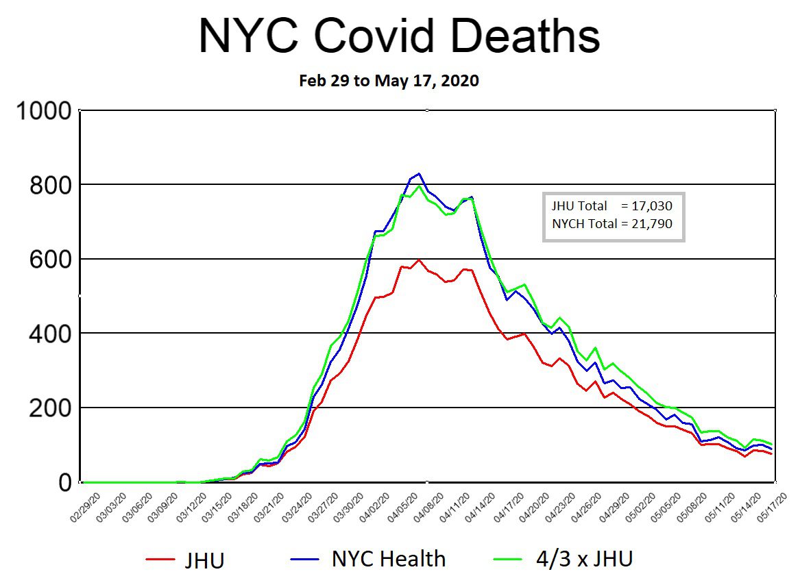
Source: JHU dashboard: https://github.com/CSSEGISandData/COVID-19/blob/master/csse_covid_19_data/csse_covid_19_time_series/time_series_covid19_deaths_US.csv
The reason that 17 May 2020 was chosen as the cutoff date for this graph is that NYC Health (NYCH) changed several key aspects of its reporting methods on this day, causing significant disruptions to the JHU trends. It should also be noted that the data used in the above graph was not entered into their respective Github repositories on the day shown. The NYCH data was first committed to the repository on 22 December 2020, after which it was adjusted multiple times over the next three years. The JHU data was entered daily until May 17, then adjusted again on July 1, Aug. 31, and September 1. Other than the fact that the September. 1 entry by JHU was done to distribute deaths in NYC by borough, we are unaware of any explanations for the other adjustments [43].
In general, both NYCH and JHU included what they called “probable deaths” in their daily numbers. Since they kept track of these amounts separately and on a daily basis, we opted to include them in the NYCH daily values (blue line) but not for JHU (red line). In this way, the difference between the blue and red lines in the above graph is on account of “probable deaths.” [43]
The similarities between the blue and green lines provide almost irrefutable proof that the “probable death” numbers were artificially generated on a computer. With a little bit of effort I was able to find a relatively simple equation that makes the match between the two lines all but perfect. However, we leave it for either NYCH or JHU to share what equation they used to generate their “probable deaths.”
We next plot Covid death data (including “probable deaths”) from only NYCH (Fig. 2 below). The smoothness of the curve is remarkable, and almost certainly reflects the use of an SIRD epidemiological model as the underlying source of the data. Naturally, since the JHU curve is identical in shape (only with smaller numbers), it too reflects an SIRD model. Since we have already established that a simple equation exists for “probable deaths,” it is fairly convincing evidence that models were used for all the data: confirmed, probable, and total.
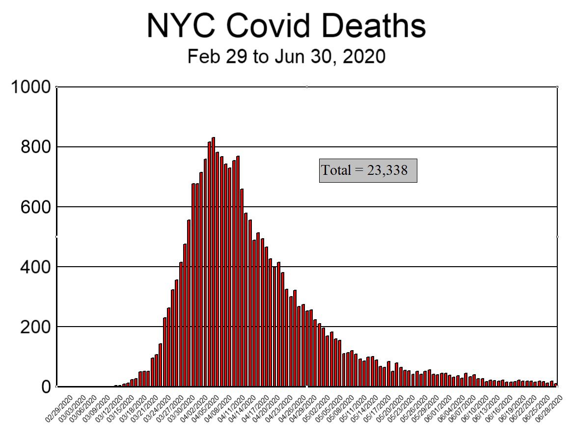
To drive this last point home, and for comparison purposes, we next plot the graph of Covid deaths in Hubei province during the first three months of 2020 (Figure 3 below). Despite the fact that the population of Hubei province (58 million) is seven times that of NYC (8.3 million), the number of deaths in Hubei (peak: 147, sum: 3,164) was significantly less than in NYC (peak: 831, sum: 23,338 ). For these numbers to be correct, it would mean that what happened in NYC was 51 times worse than what happened in the province where Covid supposedly originated. That scenario is so unlikely that it borders on preposterous, and lends support to the notion that the NYC data was not based on observed facts.
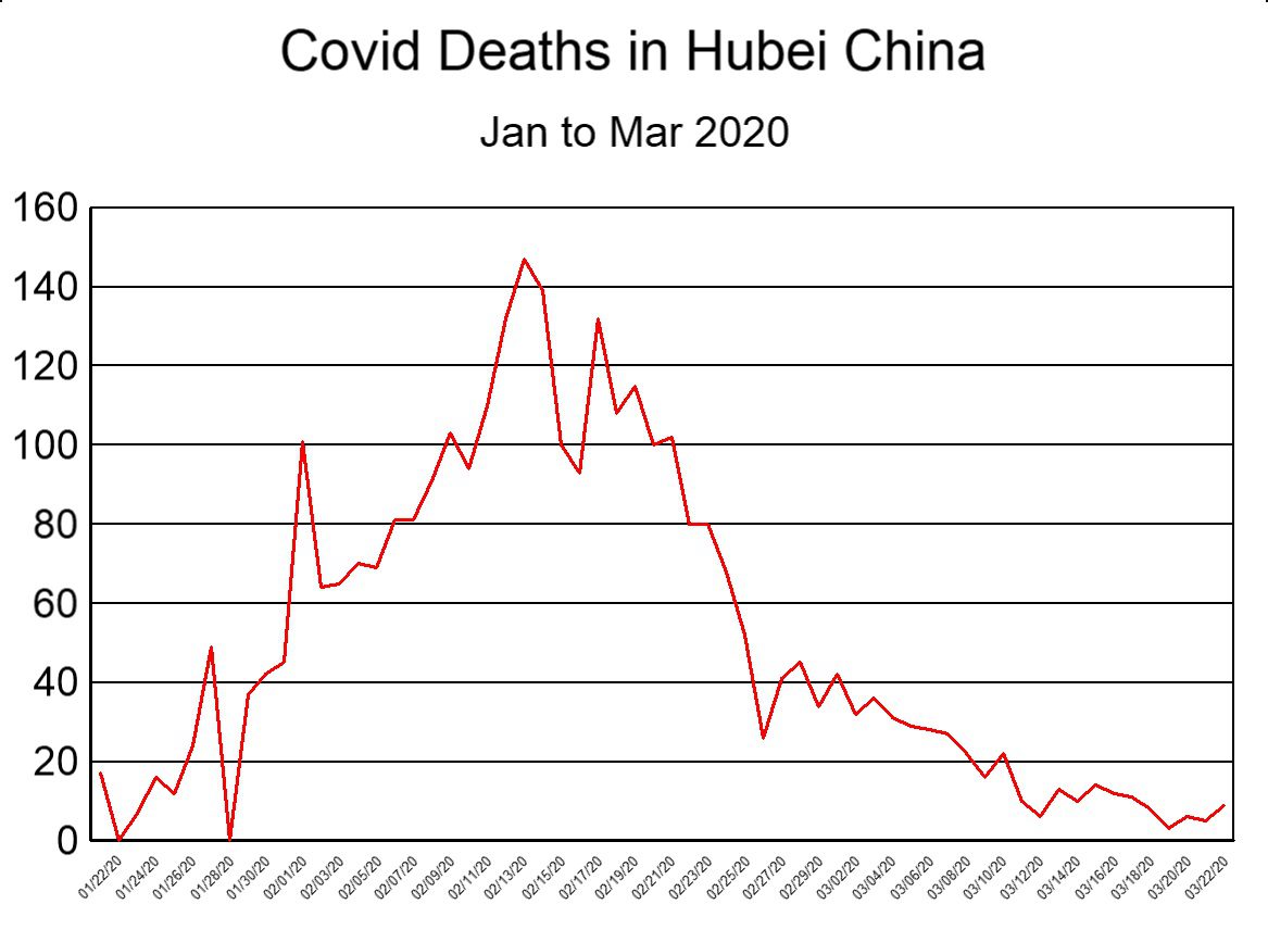
It is also observed that the graph for Hubei province (Fig. 3) is more consistent with what empirical data typically looks like (jagged), while the graph for NYC (Fig. 2) resembles what a computerised model would produce (smooth).
We have previously demonstrated that it is impossible that 23,338 people died of Covid in NYC in spring 2020 [44]. We have also demonstrated that the NYC mortality data is of questionable integrity [38]. Based on the current discussion, we now argue that the most viable explanation for the erroneous data is that a computer algorithm (based on an epidemiological model) was coupled with an improper feedback loop between JHU and NYCH. All of this suggests, and that rather strongly, that Covid death numbers for NYC were invented on a calculator rather than counted in a morgue. We invite either NYCH or JHU to explain why and how these figures should be interpreted differently, and to produce the death certificates of the deceased as proof.
Of course, if Covid death numbers in NYC were based on a computer model, it follows that the residents of NYC were subjected to three months of unnecessary terror in early 2020, being told that thousands of their neighbours were perishing on account of Covid when nobody had (or yet has) any idea how many people were actually dying. It is, therefore quite possible that nothing unusual happened in NYC in the spring of 2020 (even as nothing unusual happened in China [45]), and that the 24% average rise in 911 calls [46] during this period of time, along with the inexplicable and disturbing increase in cardiac arrests [47] were not caused by Covid but by media induced fear [48].
Conclusion
The JHU dashboard was “developed to provide researchers, public health authorities, and the general public with a user-friendly tool to track the outbreak as it unfolds.” Beside the fact that tracking any illness in real time is functionally impossible, and notwithstanding the fact that nothing special was “unfolding” when they developed it, all the evidence suggests that they succeeded in creating a Covid dashboard by using computerised models that were “corrected” from time to time with data obtained from official government websites. By mixing data from computer models with data from observations while simultaneously asserting that they “relied entirely on publicly available data,” they confounded the data so badly as to render it meaningless. As a result, the JHU Covid database is and was so unreliable that it should never have been used for determining either Covid cases or deaths.
As startling as this conclusion may sound, it is basically what Aaron Katz (a supervisor on the JHU development team) said four years ago:
“Ten years from now we’ll see all the reports and retrospectives that will tell us exactly what happened and where….[But for now,] we’re trying to solve this problem of situational awareness in the present moment” [11].
At the very least his words inform us that it typically takes ten years to get accurate data on a specific illness. At the worst, the quote assures us that the JHU dashboard was unreliable, that the trust placed in the data was entirely misplaced, and that the JHU dashboard caused many wrong conclusions about Covid.
In view of all these facts and observations:
- We call on governments and statistical offices around the world to return to their former slow but accurate process of collecting reliable data through normal channels,
- We encourage medical researchers to resist the temptation to use Covid data from the JHU repository and instead wait until reliable data becomes available,
- We request John Hopkins University to be fully open and transparent about the computer code, models, sources, and procedures used in their dashboard,
- We invite New York City to begin a transparent inquiry into if and how their data was corrupted by computer models, and, lastly,
- We urge the general public to be more critical of any claims asserting “real-time” global statistics of a disease.
The author is thankful for the invaluable assistance provided by colleagues and contributors to this article who wish to remain nameless.
References
- Dong E, Du H, Gardner L. An interactive web-based dashboard to track COVID-19 in real time. Lancet Infect Dis. 2020 May;20(5):533-534. doi: 10.1016/S1473-3099(20)30120-1. Epub 2020 Feb 19. Erratum in: Lancet Infect Dis. 2020 Sep;20(9):e215. PMID: 32087114; PMCID: PMC7159018.
- Anonymous, “COVID-19 Data Repository by the Center for Systems Science and Engineering (CSSE) at Johns Hopkins University,” 2024, github https://github.com/CSSEGISandData/COVID-19.
- Anonymous, “Novel Coronavirus (2019-nCoV), SITUATION REPORT – 1, 21, JANUARY 2020,” Jan 2020, WHO, https://www.who.int/docs/default-source/coronaviruse/situation-reports/20200121-sitrep-1-2019-ncov.pdf
- Lucero Y, Matson DO, Ashkenazi S, George S, O’Ryan M. “Norovirus: Facts and Reflections from Past, Present, and Future.” Viruses. 2021 Nov 30;13(12):2399. doi: 10.3390/v13122399. PMID: 34960668; PMCID: PMC8707792.
- Anonymous, “Event 201 Pandemic Exercise: Highlights Reel,” YouTube, Nov 2019, https://www.youtube.com/watch?v=AoLw-Q8X174
- Perkel, Jeffrey, “Behind the Johns Hopkins University coronavirus dashboard,” Apr 2020, Nature, https://www.nature.com/nature-index/news/behind-the-johns-hopkins-university-coronavirus-dashboard
- Anonymous, “COVID-19 Dashboard by the Center for Systems Science and Engineering (CSSE) at Johns Hopkins University (JHU),” 2024, arcgis, https://www.arcgis.com/apps/dashboards/bda7594740fd40299423467b48e9ecf6
- Fischer-Hwang, Irena, Mayo, Justin, “A comparison of four major COVID-19 data sources.” May 2020, https://source.opennews.org/articles/comparison-four-major-covid-19-data-sources/
- George, Anita, “The most reliable coronavirus dashboards,” Mar 2020, digitaltrends, https://www.digitaltrends.com/cool-tech/most-reliable-coronavirus-dashboards/
- Anonymous, “Professor Lauren Gardner Discusses How the COVID-19 Dashboard is Built and Maintained,” Mar 2020, YouTube, JHU channel, https://www.youtube.com/watch?v=0JR9qhz2eMw
- Gardner L. “The COVID-19 Dashboard for Real-time Tracking of the Pandemic: The Lasker-Bloomberg Public Service Award.” JAMA. 2022;328(13):1295–1296. doi:10.1001/jama.2022.15590
- Anonymous, “Behind the Scenes of Johns Hopkins’ COVID-19 Dashboard,” Oct 2020, JHU, https://ventures.jhu.edu/news/johns-hopkins-covid-19-dashboard-map-lauren-gardner/
- Anonymous, “LIFE EXPECTANCY AND DEATHS – STATISTICS,” 2024, StatsCan, https://www.statcan.gc.ca/en/subjects-start/health/life_expectancy_and_deaths
- Anonymous, “Estimated Influenza Illnesses, Medical Visits, Hospitalizations, and Deaths in the United States: 2017–2018 Influenza Season,” CDC, 2019, https://www.cdc.gov/flu/about/burden/2017-2018.htm
- Anonymous, “HMD Russia,” 2024, HMD, https://mortality.org/Country/Country?cntr=RUS
- Ensheng Dong et al, “The Johns Hopkins University Center for Systems Science and Engineering COVID-19 Dashboard: data collection process, challenges faced, and lessons learned,” Aug 2020, Lancet, https://www.ncbi.nlm.nih.gov/pmc/articles/PMC9432867/
- Badker, Rinette et al, “Challenges in reported COVID-19 data: best practices and recommendations for future epidemics,” May 2021, BMJ, Global Health 2021;6:e005542, https://gh.bmj.com/content/6/5/e005542.long
- SteveForsythe, “US total cases data from 3/10 are internally inconsistent. #496,” Mar 2020, github, https://github.com/CSSEGISandData/COVID-19/issues/496
- Anonymous, “Worldometer COVID-19 Data,” 2024, Worldometer, https://www.worldometers.info/coronavirus/about/
- McLean, Scott et al, “The Covid-19 pandemic has catapulted one mysterious data website to prominence, sowing confusion in international rankings,” May 2020, CNN, https://edition.cnn.com/interactive/2020/05/world/worldometer-coronavirus-mystery/
- Sergio Hernandez (CNN), “The Covid-19 pandemic has catapulted one mysterious data website to prominence, sowing confusion in international rankings,” May 2020, CNN, https://www.documentcloud.org/documents/6893857-JHU-Response-to-CNN-Re-Worldometer.html
- CSSEGISandData, “Techncial Issue #650,” Mar 2020, github, https://github.com/CSSEGISandData/COVID-19/issues/650
- Anonymous, “Web scraping during the COVID-19 pandemic,” 2024, StatsCan, https://www.statcan.gc.ca/en/our-data/where/web-scraping/covid-19
- Anonymous, “Novel Coronavirus(2019-nCoV) Situation Report – 11,” Jan 31, 2020, WHO, https://www.who.int/docs/default-source/coronaviruse/situation-reports/20200131-sitrep-11-ncov.pdf
- Gardner, Lauren, “Update January 31: Modeling the Spreading Risk of 2019-nCoV,” Jan 2020, JHU, https://systems.jhu.edu/research/public-health/ncov-model-2/
- hikarine3, “Death number is wrong for Japan #331,” Mar 2020, github, https://github.com/CSSEGISandData/COVID-19/issues/331
- lmirny, “INCORRECT DATA FOR New York Fatalities #2257,” Apr 2020, github, https://github.com/CSSEGISandData/COVID-19/issues/2257
- Gardner, Lauren, “Welcome to Dr. Gardner’s Lab,” 2024, JHU, https://systems.jhu.edu/lauren_gardner/
- Zlojutro, A., Rey, D. & Gardner, L. A decision-support framework to optimize border control for global outbreak mitigation. Sci Rep 9, 2216 (2019). https://www.nature.com/articles/s41598-019-38665-w
- Anonymous, “About CSSE,” 2024, JHU, https://systems.jhu.edu/about/about-csse/
- Pietz, Jesse, et al, “Chasing John Snow: data analytics in the COVID-19 era,” European Journal of Information Systems, Jul 2020, https://www.tandfonline.com/doi/full/10.1080/0960085X.2020.1793698
- JocktheDog, Twitter thread, Nov 2020, https://x.com/jockthedog2/status/1333502166829502465?s=46&t=02VgKKfIbjSkG-GVjyenxw https://threadreaderapp.com/thread/1333502166829502465.html
- Ferguson, Neil, “Report 9: Impact of non-pharmaceutical interventions (NPIs) to reduce COVID-19 mortality and healthcare demand,” Mar 2020, ICCRT, https://www.imperial.ac.uk/media/imperial-college/medicine/sph/ide/gida-fellowships/Imperial-College-COVID19-NPI-modelling-16-03-2020.pdf
- Anonymous, “COVID-19 in Canada: Using data and modelling to inform public health action,” Apr 2020, PHAC, https://www.canada.ca/content/dam/phac-aspc/documents/services/diseases/2019-novel-coronavirus-infection/using-data-modelling-inform-eng.pdf
- Magness, Phillip W., “The Failure of Imperial College Modeling Is Far Worse than We Knew,” 2021, AIER, https://www.aier.org/article/the-failure-of-imperial-college-modeling-is-far-worse-than-we-knew/
- Biggs, Adam, LittleJohn, Lanny, “Revisiting the initial COVID-19 pandemic projections” Mar 2021, Lancet, DOI:https://doi.org/10.1016/S2666-5247(21)00029-X
- Engler, Jonathan, “Were the unprecedented excess deaths curves in Northern Italy in spring 2020 caused by the spread of a novel deadly virus?” July 2023, Pandata, https://pandata.org/northern-italy-excess-deaths/
- Verduyn, Thomas, et al, “Does New York City 2020 Make Any Sense?” Oct 2023, Panda, https://pandata.org/does-new-york-city-2020-make-any-sense/
- Verduyn, Thomas et al, “Covid mortality patterns in the USA,” Oct 2023, Pandata, https://pandata.org/covid-mortality-patterns-in-the-usa/
- Verduyn, Thomas et al, “Worldwide Covid Mortality Patterns,” Oct 2023, Pandata, https://pandata.org/worldwide-covid-mortality-patterns/
- Safety Investigation Team for MH370, “SAFETY INVESTIGATION REPORT Malaysia Airlines Boeing B777-200ER (9M-MRO),” March 2014, Pg 242, https://reports.aviation-safety.net/2014/20140308-0_B772_9M-MRO.pdf
- Mentour Pilot, “A NEW Trace! The FULL MH370 Story…So Far,” Mar 2024, YouTube, https://www.youtube.com/watch?app=desktop&v=Y5K9HBiJpuk&t=2060
- CSSEGISandData, “New York City Borough Level Data now live #3084,” Aug 2020, GitHub, https://github.com/CSSEGISandData/COVID-19/issues/3084
- Kenyon, Todd, “What the Diamond Princess tells us about NYC in Spring 2020,” May 2023, Panda, https://pandata.org/what-the-diamond-princess-tells-us-about-nyc-in-spring-2020/
- Verduyn, Thomas, “Revisiting China: Did a Pandemic really start in Wuhan?” Feb 2024, Panda, https://pandata.org/revisiting-china-did-a-pandemic-really-start-in-wuhan/
- Prezant, David J., et al, “System impacts of the COVID-19 pandemic on New York City’s emergency medical services,” Nov. 2020, JACEP, https://onlinelibrary.wiley.com/doi/10.1002/emp2.12301
- Lai PH, et al, “Characteristics Associated With Out-of-Hospital Cardiac Arrests and Resuscitations During the Novel Coronavirus Disease 2019 Pandemic in New York City.” JAMA Cardiol. 2020 Oct 1;5(10):1154-1163. doi: 10.1001/jamacardio.2020.2488. PMID: 32558876; PMCID: PMC7305567.
- Rabinstein, Alejandro A., “Chapter 2 – Sudden cardiac death,” 2014, Handbook of Clinical Neurology, 2014, Pages 19-24, ISSN 0072-9752, ISBN 9780702040863, https://doi.org/10.1016/B978-0-7020-4086-3.00002-3.